Challenge & Objective: I created a skincare brand that translates the idea of “less is more” into an identity that feels intentionally simple and refined. Cloudly was designed with clarity at its core, using a clean, minimal visual system inspired by the softness of nature. A light, airy color palette and subtle brand elements communicate freshness, purity, and calm, positioning Cloudly as both a skincare brand and a lifestyle centered on balance and mindful self-care.
Deliverables: Packaging designs, Logo and Branding System, Business Card and Letterhead, Other brand mockups
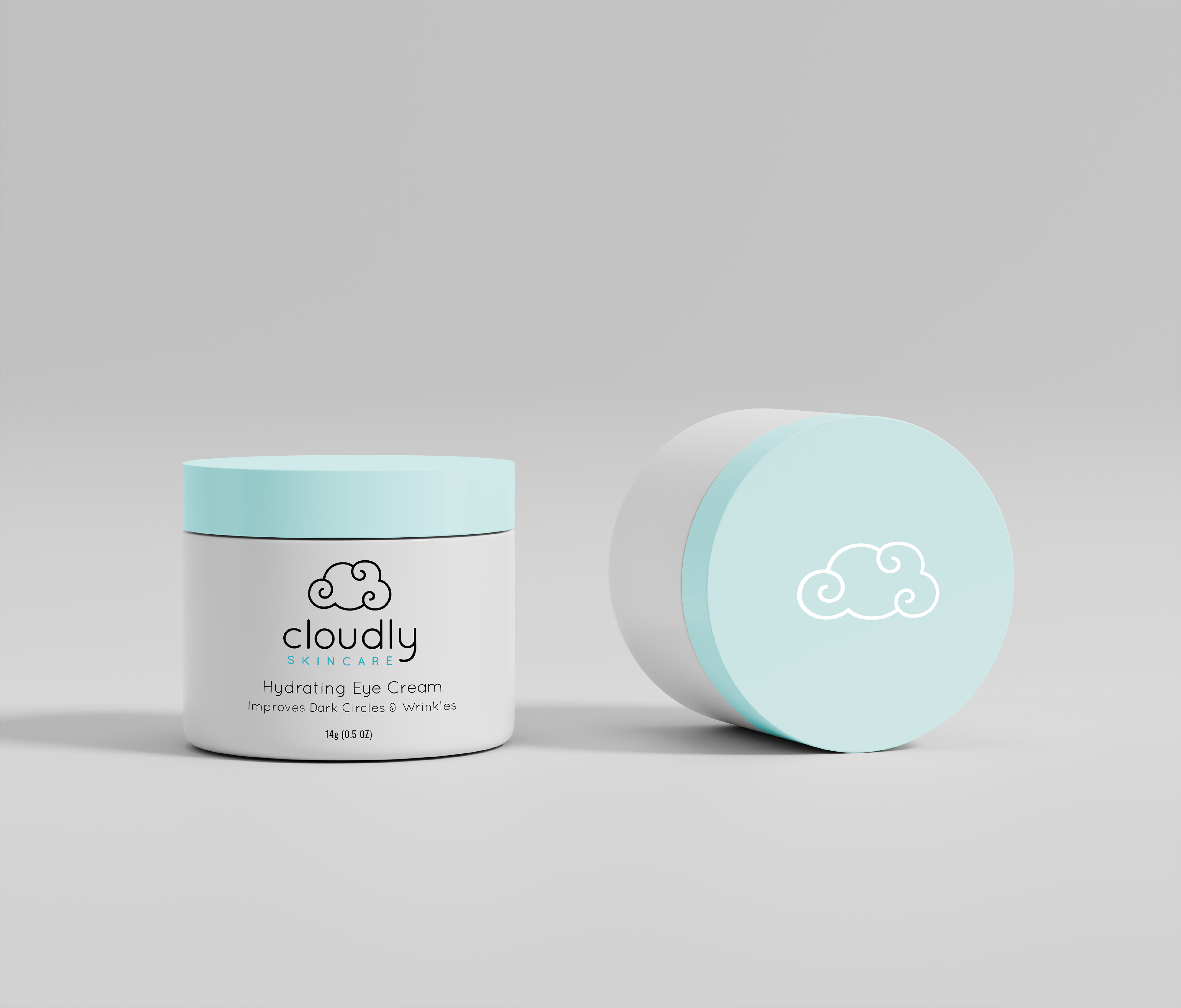
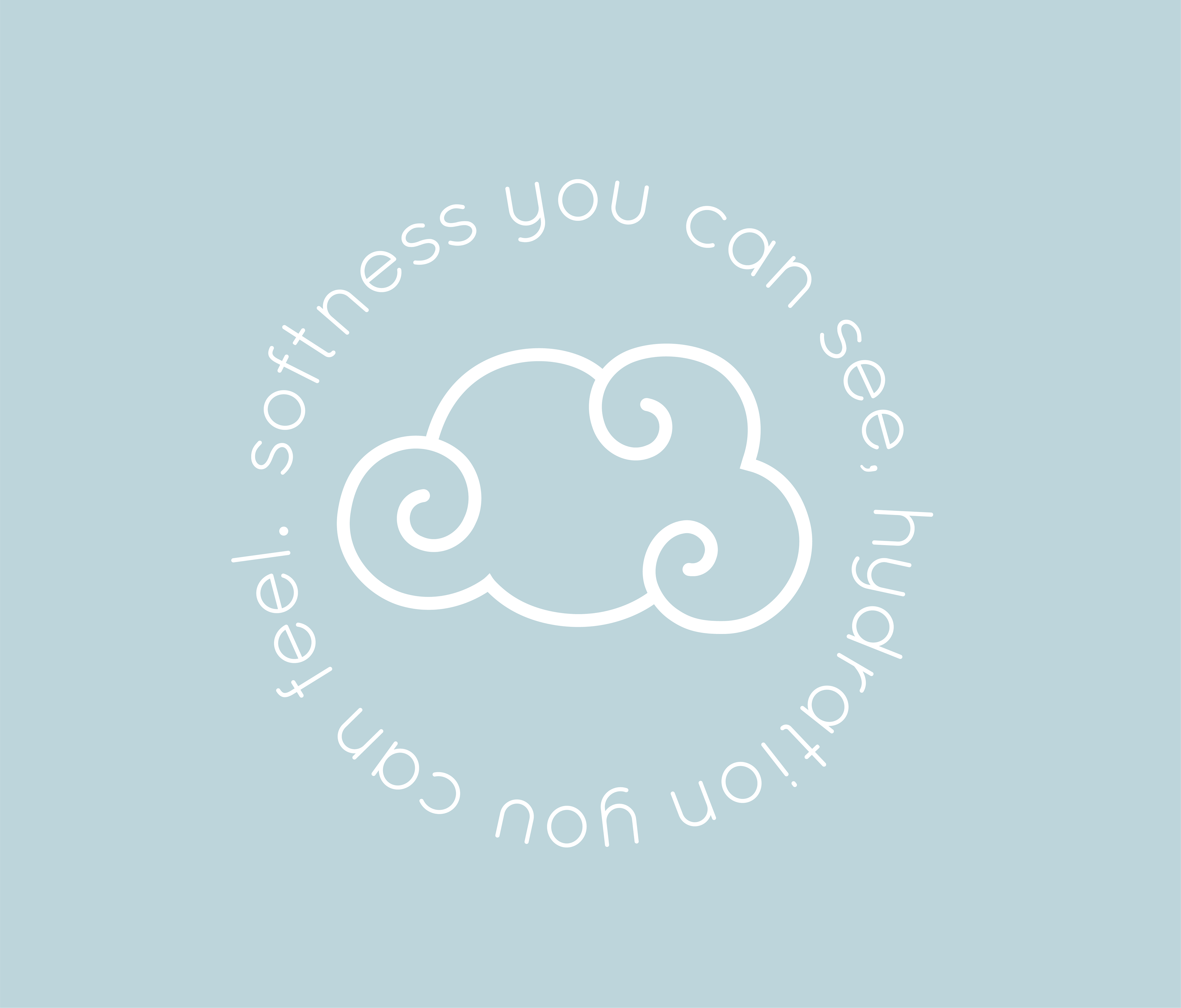
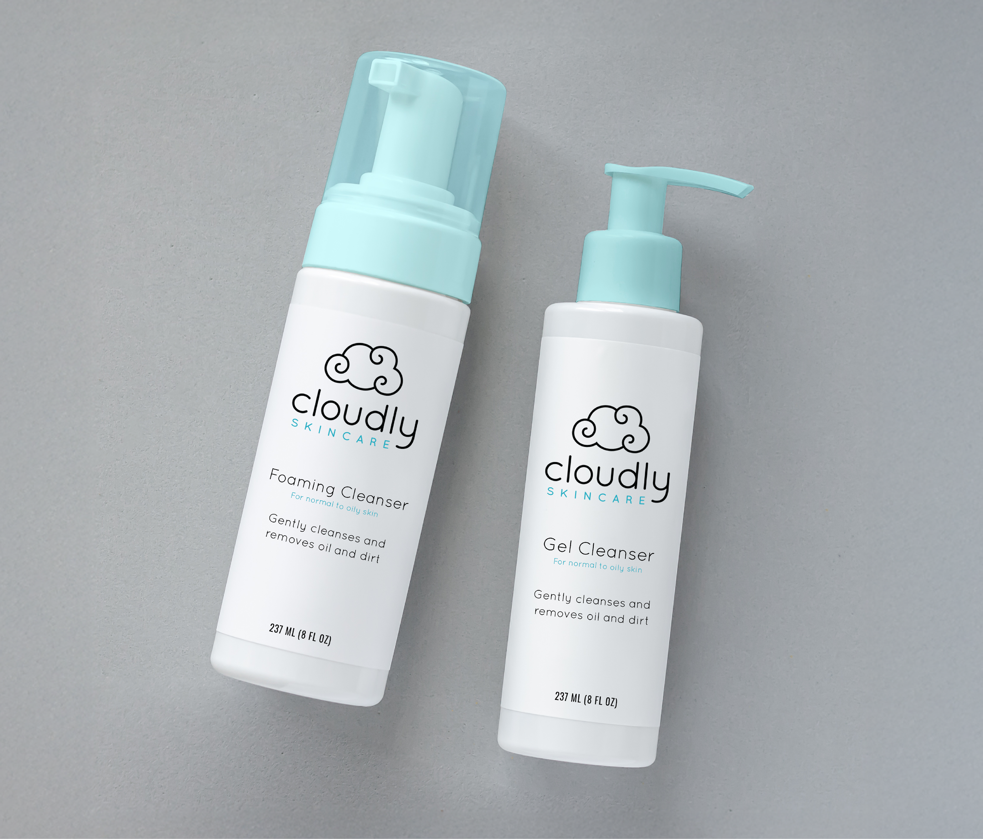
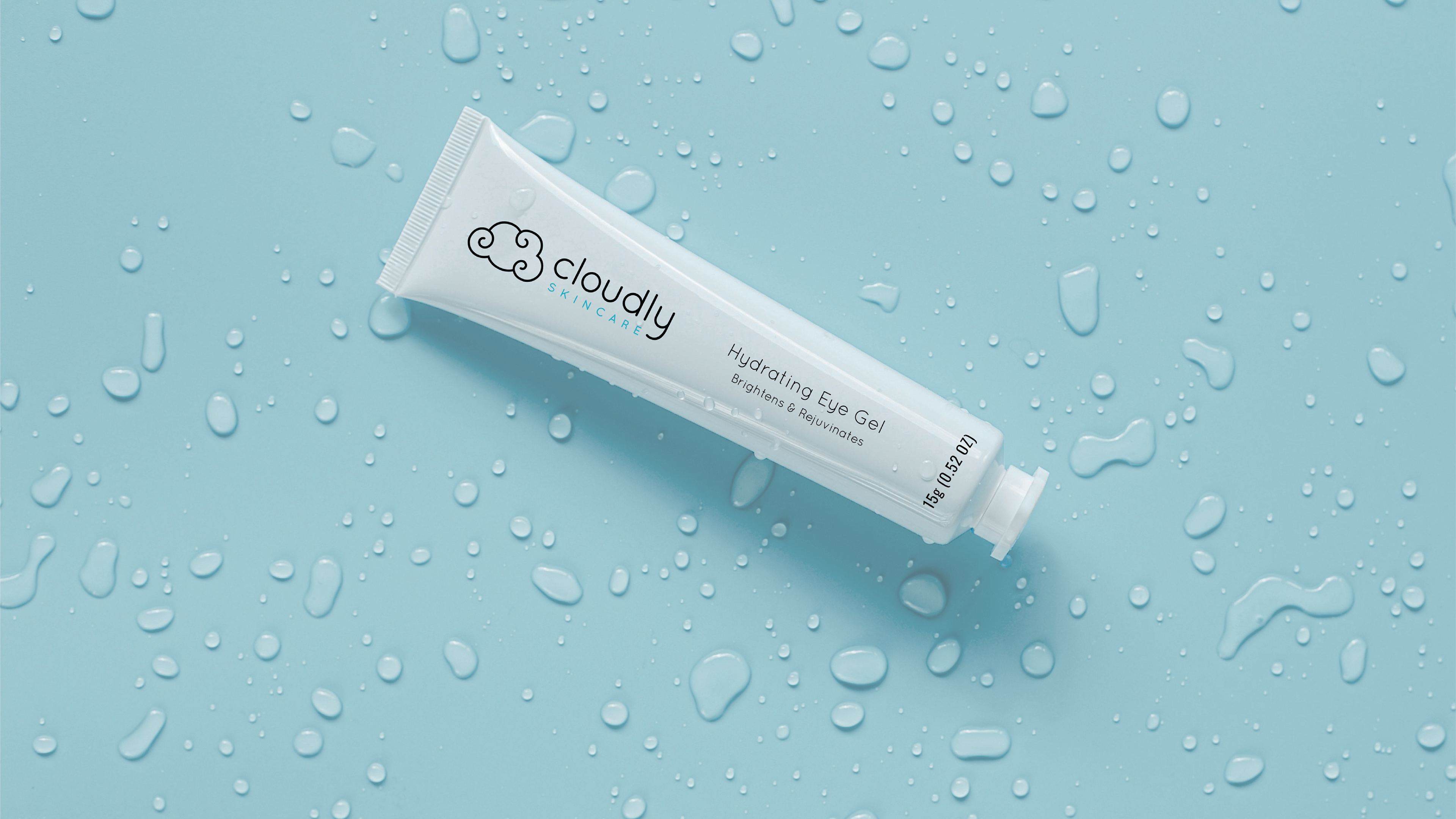
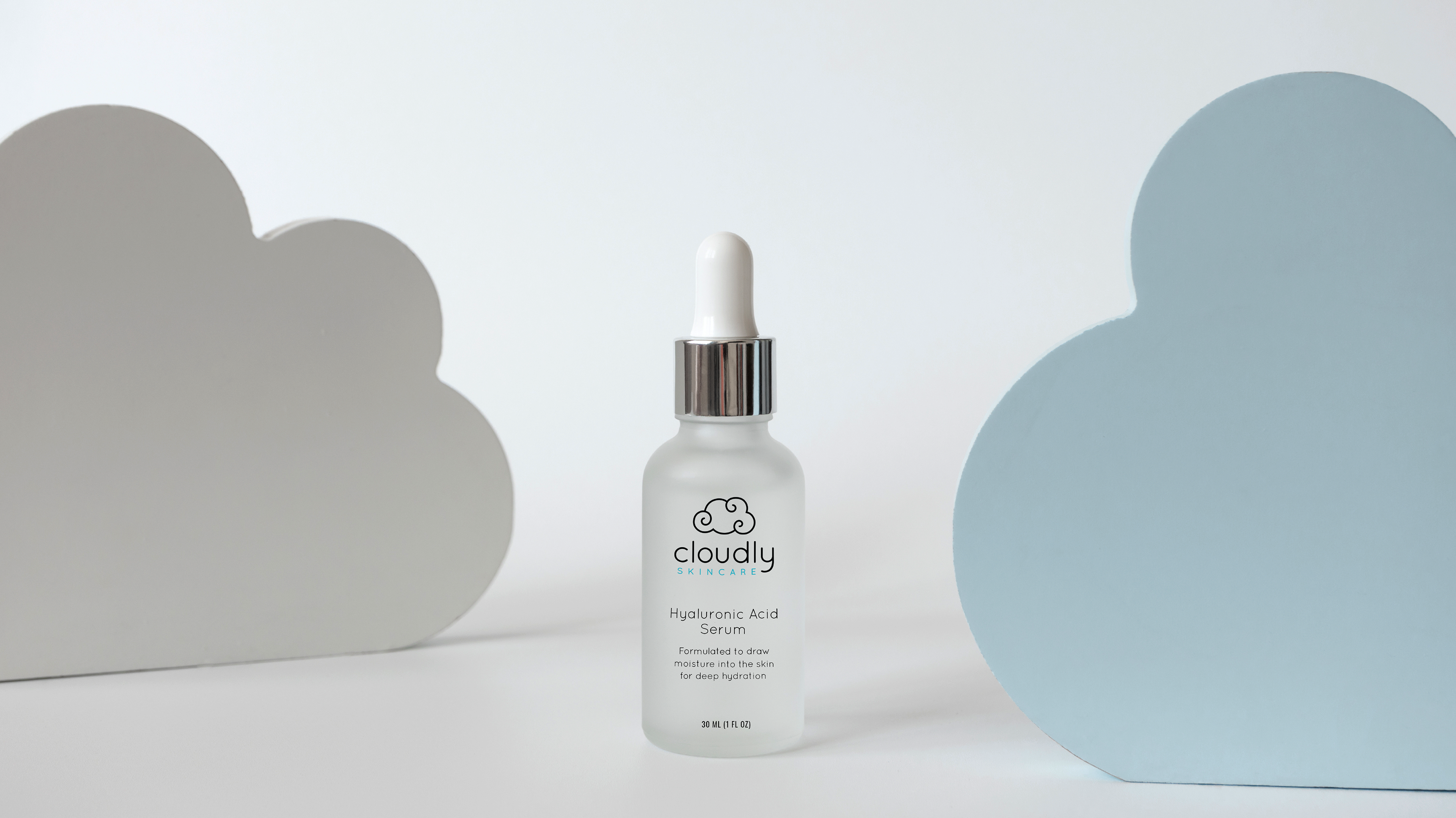
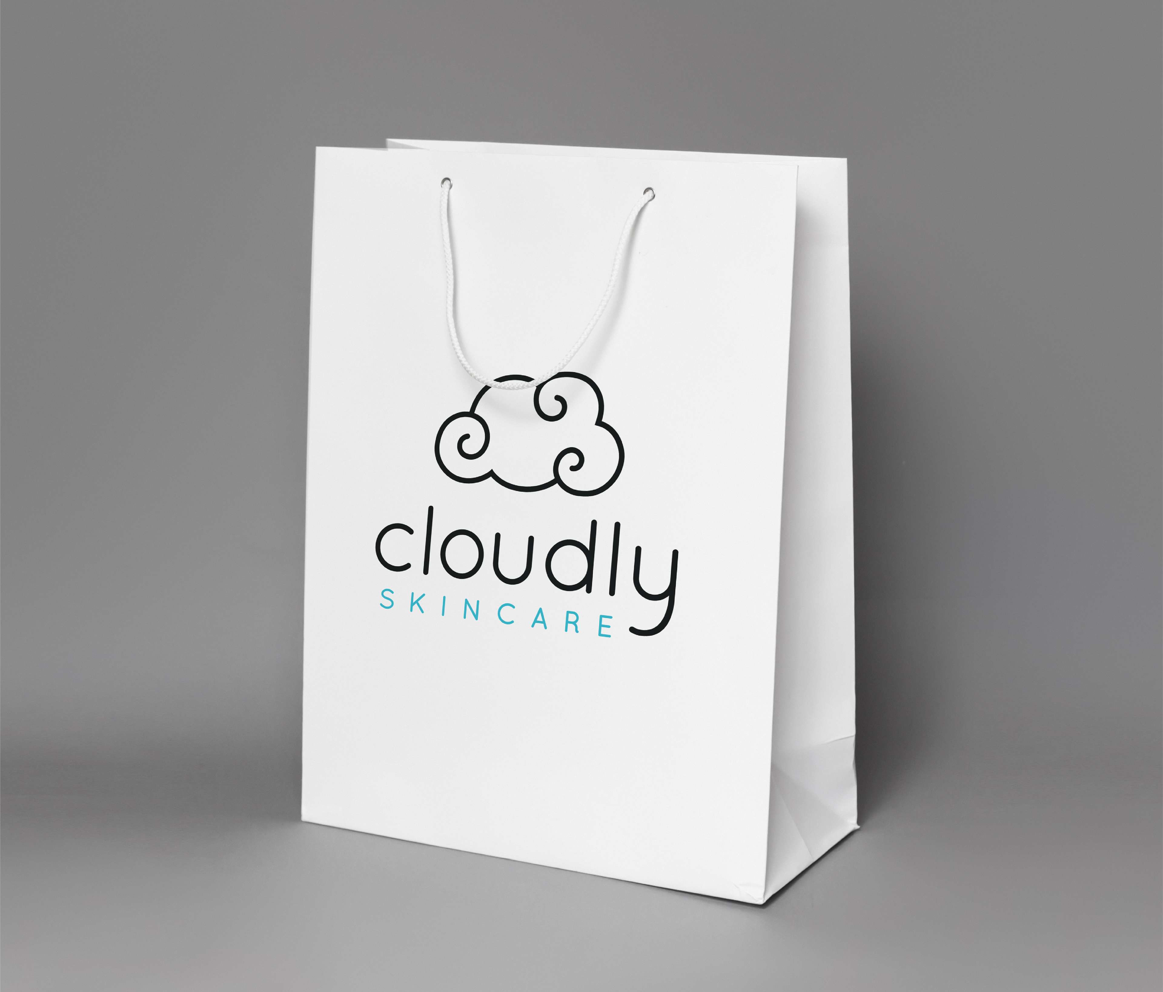

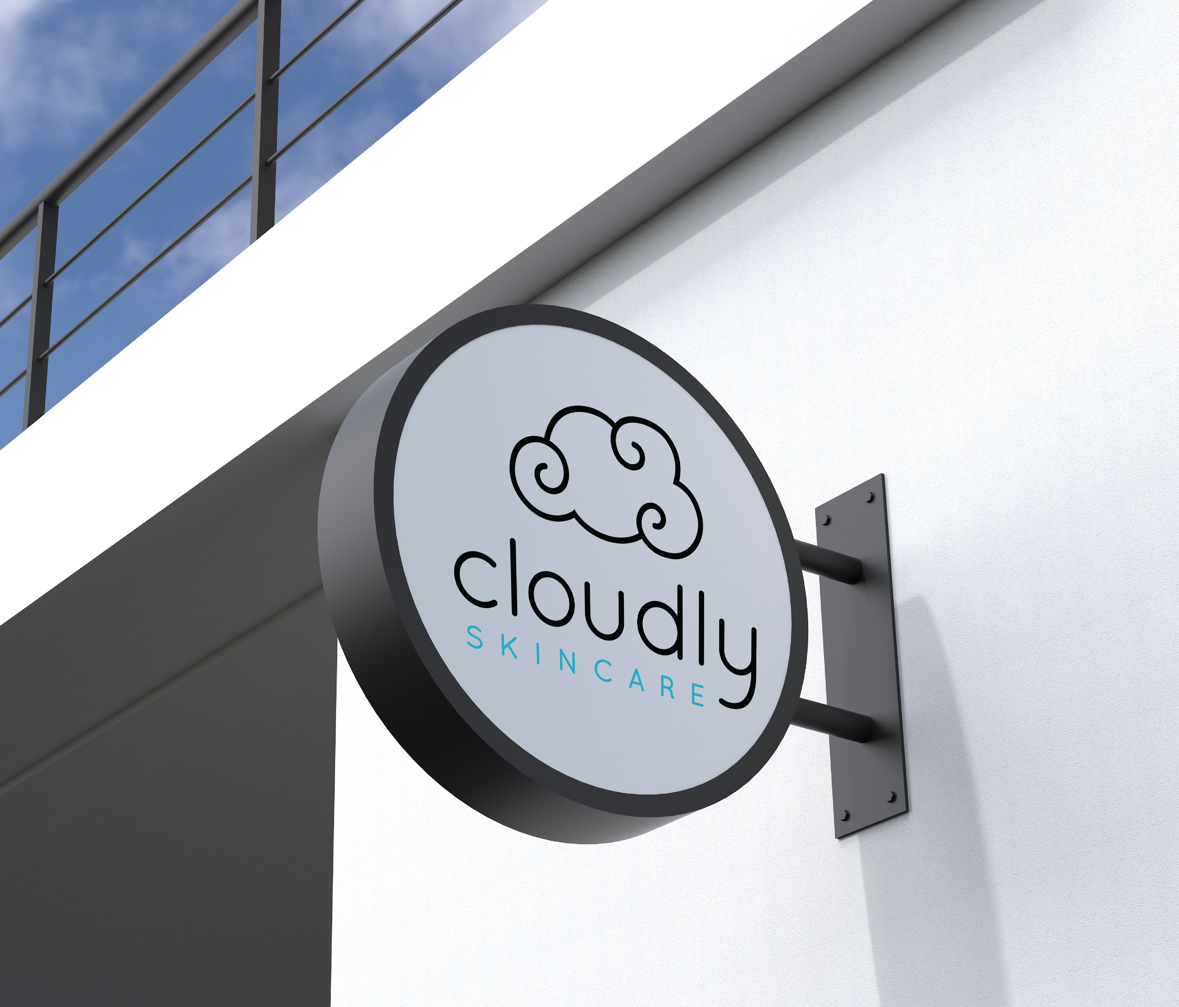
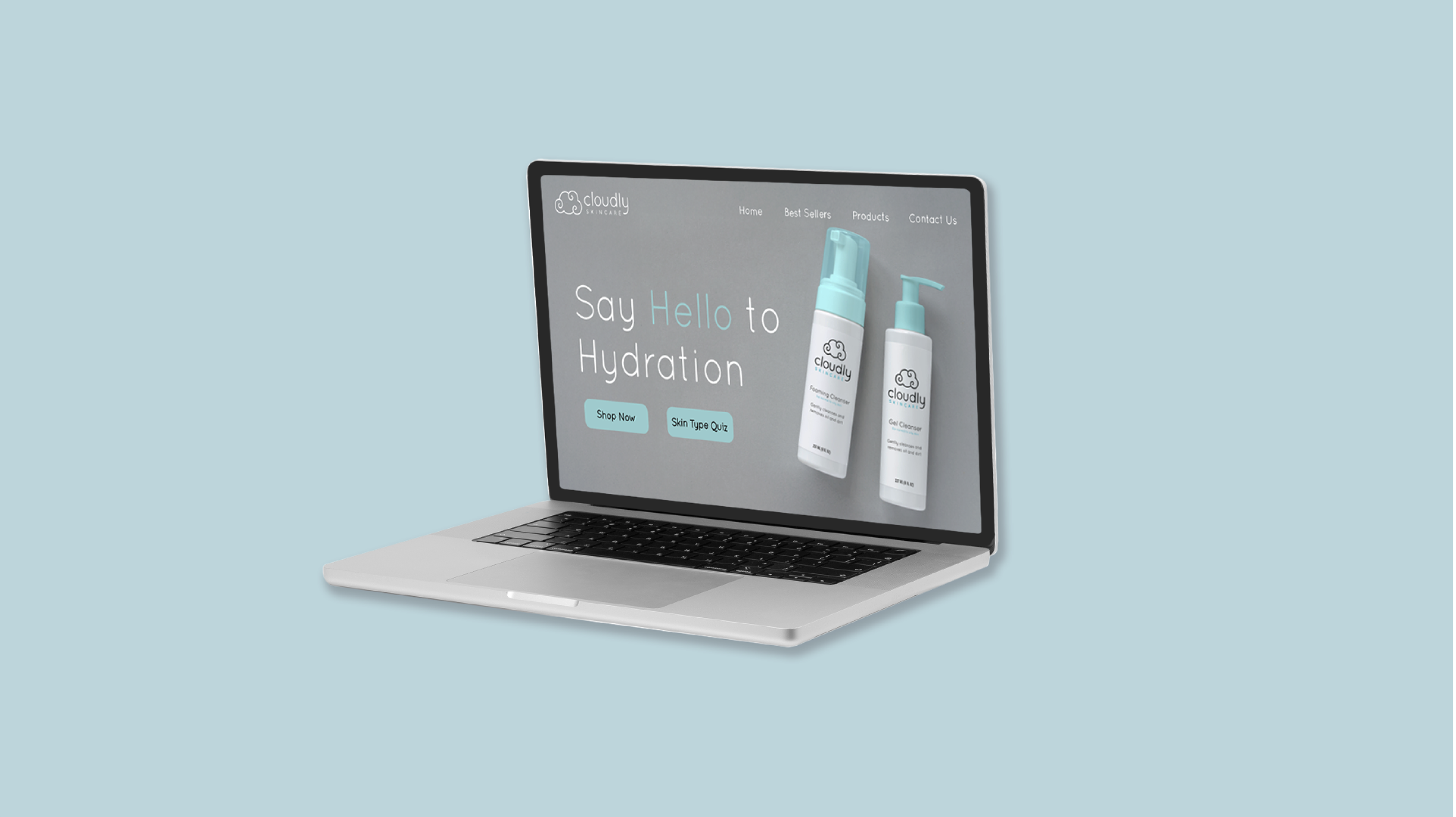
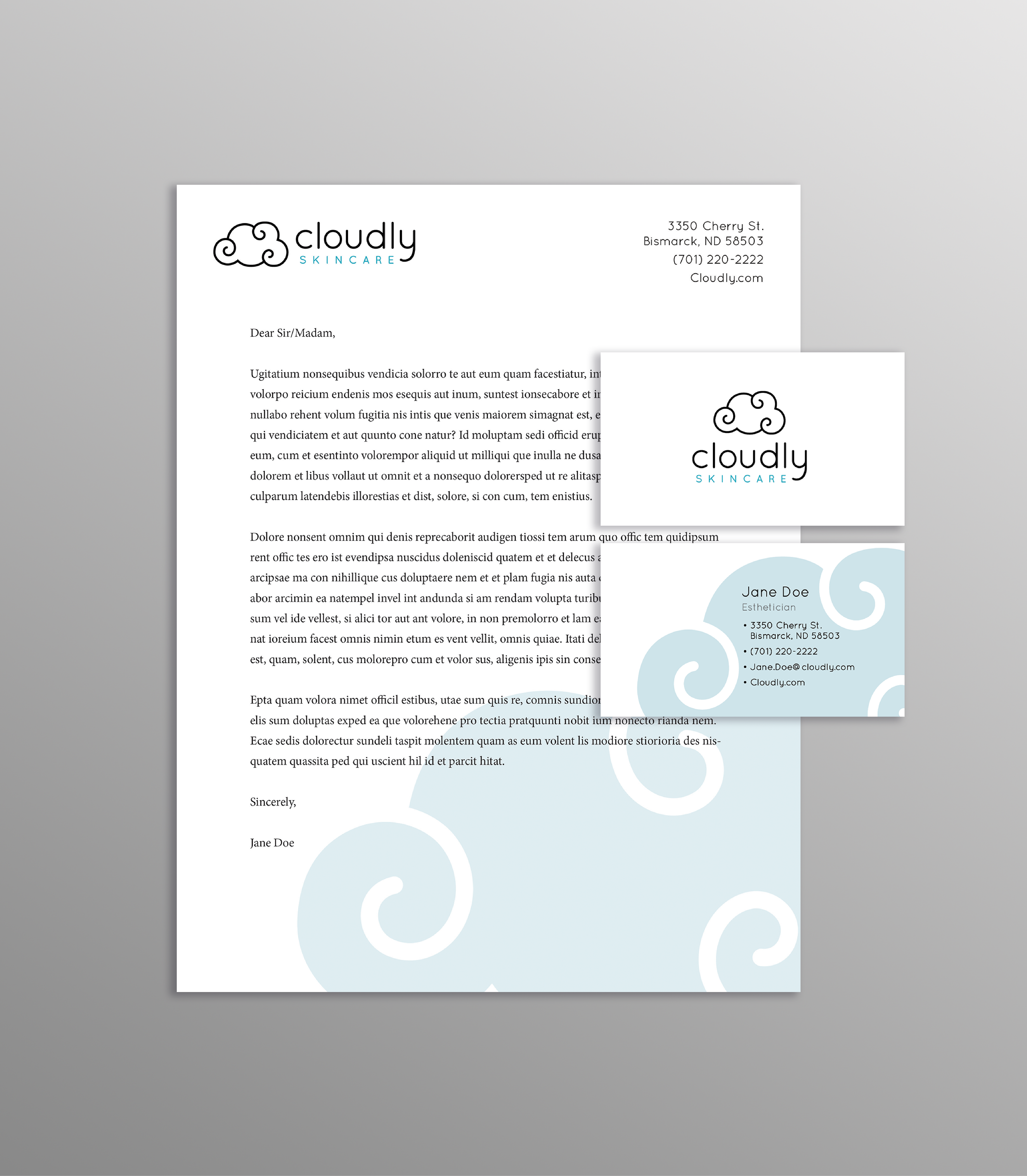
Brand Development and Visual Direction: The visual identity for Cloudly was developed to reflect the feeling of lightweight, breathable skincare. I began with the idea of airiness, how skincare should feel effortless, calming, and gentle on the skin. This led to the cloud symbol, which serves as both a literal and symbolical anchor for the brand. The cloud represents softness, lightness, and clarity, reinforcing Cloudly’s “less is more” philosophy.
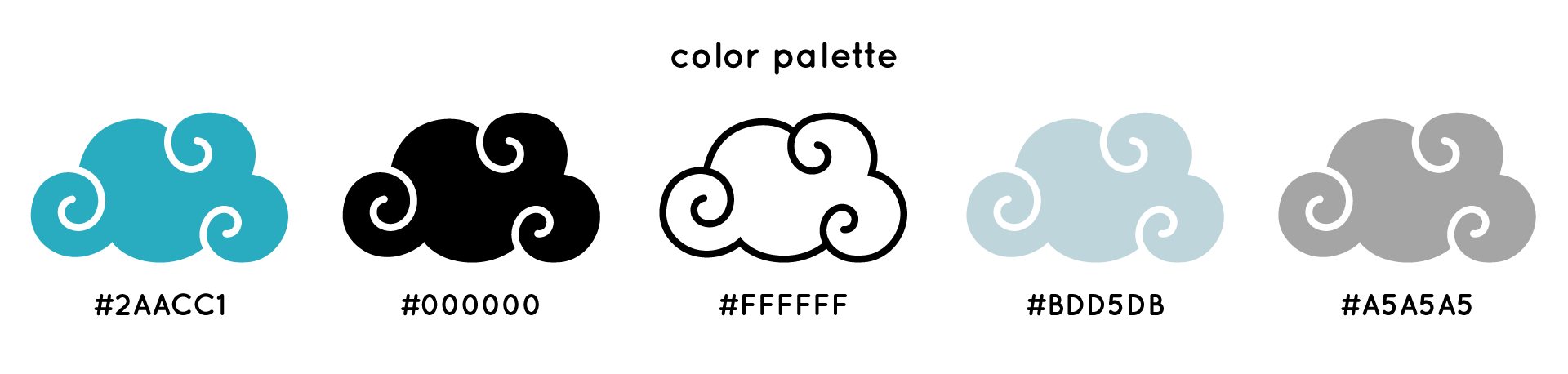
The color palette was intentionally kept light and neutral to evoke purity and balance, with subtle pops of soft blue inspired by open skies and natural light. Blue was chosen not only for its connection to clouds and air, but also for its associations with calm, trust, and freshness which are qualities essential to a skincare brand focused on mindful self-care.
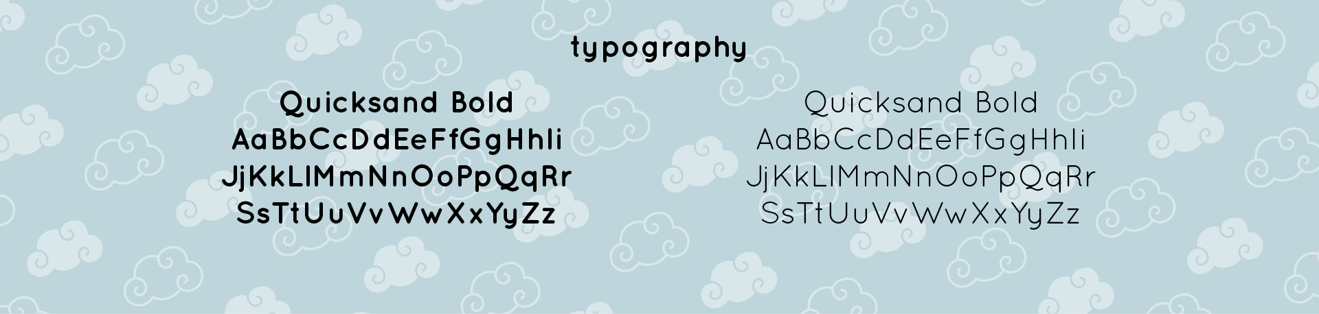
Typography was selected to complement the minimal aesthetic without feeling cold or clinical. Clean, modern typefaces with gentle curves were used to maintain readability while echoing the softness of the brand. Together, the logo, color palette, and typography create a cohesive system that feels refined, approachable, and calming, positioning Cloudly as both a skincare brand and a lifestyle rooted in simplicity and intention.